Here are 5 Ways GIFs Can Amplify Your Content While at times GIFS get a bad rap, if used correctly they can punch up your content and differentiate your blog from others.
This story originally appeared on Visual.ly

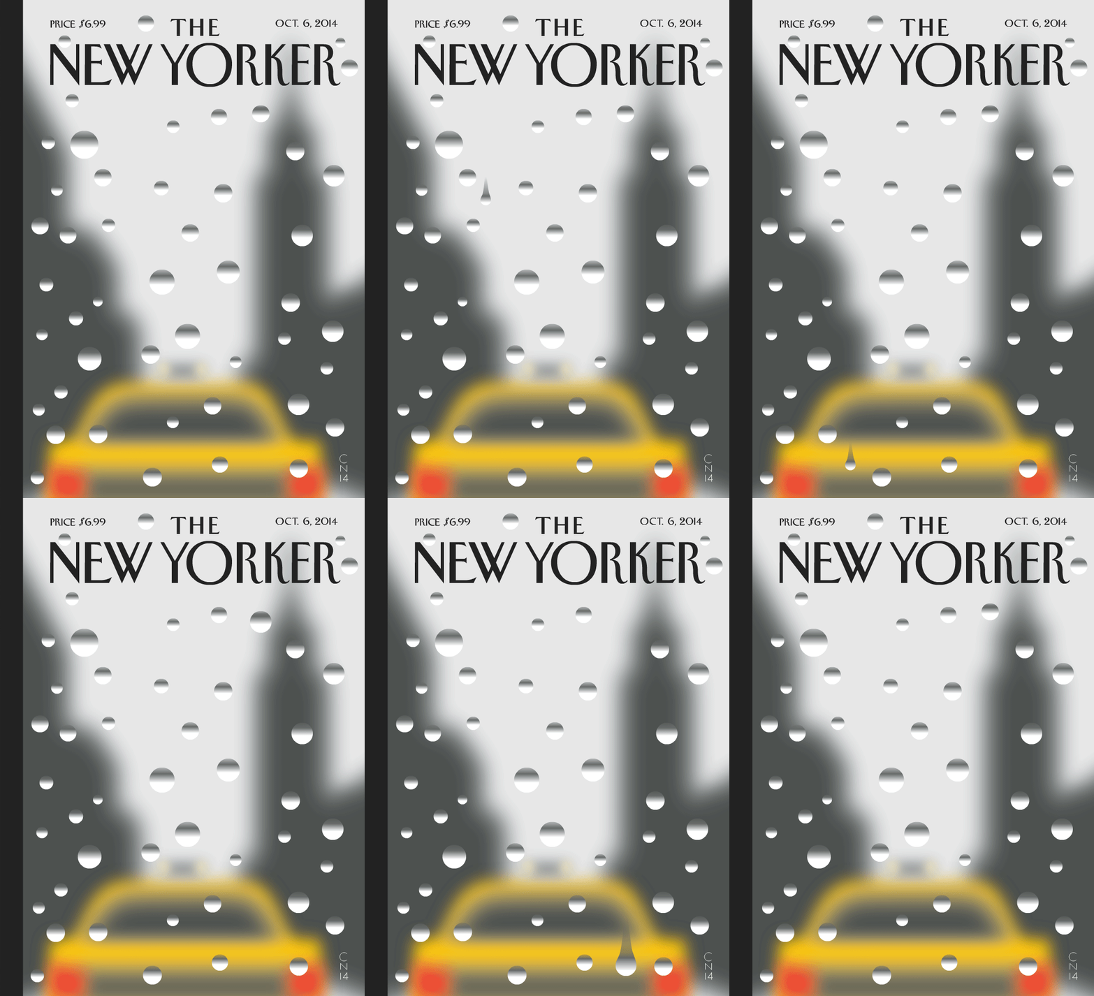
The animated GIF (an acronym of Graphics Interchange Format) gets a bad rap because it's widely abused in popular culture: Sparkling MySpace graphics and cheesy movie memes, we're looking at you. But last month, the New Yorker released its first cover designed as a GIF, adding an air of respectability to the once lowly format. It was subtle, true to their brand aesthetic and a perfect example of one way marketers can use the file format: to add panache to their visual content. You can easily do the same.

Marketers, Rethink the GIF
Animated GIFs are static images linked together in a single graphic to create a short animation, like a looping cartoon flip book. Think of the format the way you would think of a flip book. The more frames, the richer and more seamless the animation will appear. Sometimes, it makes sense to only use a few frames in your GIF, such as when you want to show blinking lights or a handful of text slides. Other times you may want to opt for a smoother look that approaches that of video (without having to spend the money that you would on video or animation).
Here are five ways to use GIFs to amplify your content:
1. Enhance Your Message
The New Yorker's cover would have sufficed as a flat image without the animated raindrop. But, when the raindrop slides down the page, it captures our attention and looks much more realistic. It changes the composition from what looks like a painting to the equivalent of an actual pane of glass, bespeckled with raindrops.
When using GIFs to enhance the visual composition of your content, it's best to keep them subtle. It's also important to consider how they'll look when the loop restarts. Repeating elements like the New Yorker's raindrop or twinkling stars work best.

2. Get more mileage
A GIF can help amplify your communication in a smaller space where you may limit you to a certain number of characters or real estate. The best example of this scenario is using a GIF attached to a tweet -- since Twitter has started supporting in-line gifs, you can use them to capitalize on the extra real estate they afford.
Using a GIF on Twitter provides limitless options as a visual canvas-- think about creating a micro-presentation, sharing a mini-screen recording or even a simple cartoon to complement your tweet's primary message.

3. Communicate better
You can use a GIF to show your audience something that's better illustrated than described such as an animated diagram. There is truth to the ancient adage, "a GIF is worth a thousand words."
The growth of poverty has been going on since 2000 https://t.co/6cfuBJkoZF http://t.co/FUVXMiF3Jh
— Ralf S. Rho (@ralfrho) October 16, 20144. Emphasize key points
GIFs can also add emphasis to a particular component of your message. For example, if your message centers around a particular theme, supplementing it with a GIF can help drive home the main point.

5. Increase Sharing and Engagement
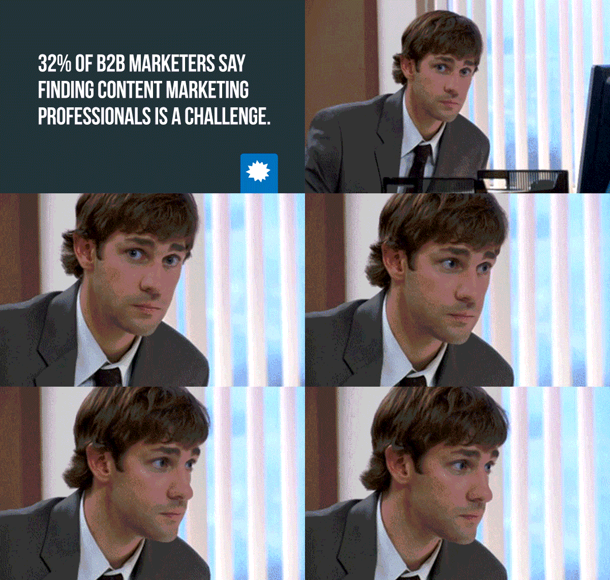
GIFs, by nature, are a shareable file format and thus make a great addition to a tweet, blog post or webpage. The GIFs are eye-catching and can help to propel your main message. When used thoughtfully and not gratuitously, they can serve as a great way to illustrate the points you are trying to get across. For example, this blog post from our friends at Kapost, "13 Terrifying Marketing Stats" presents each statistic about content marketing as an individual GIF. It's a a clever way to maximize the impact of the content spend. Rather than a single blog post, Kapost ends up with thirteen unique pieces of micro-content that can be shared individually across social channels and drive traffic back to Kapost's domain.


