Branding's Cardinal Sins: 3 Common Mistakes to Avoid In launching a new company, resist the urge to be overly creative and dull when dreaming up your brand name. See our list of branding's cardinal sins.
By Alanna Francis Edited by Dan Bova
Opinions expressed by Entrepreneur contributors are their own.

Anyone who has ever started a business, or been involved in the creation of one, knows that branding is one of the most important and challenging exercises a fledgling company faces. Your idea might be a powerful one, but if it's branded improperly it could fail before anyone even gives it a chance.
When considering the branding of your own nascent company, learn from others' mistakes. Consider the following common pitfalls to which many brands -- including established ones that should know better -- have recently succumbed.
1. Choosing a bad name:
There are many ways the branding of a new endeavor can go awry, but choosing a bad name is a cardinal sin that unfortunately gets routinely committed. But what specifically makes a brand name bad?
- It's difficult or confusing to pronounce.
Brand names which are difficult to pronounce do not inspire confidence in those who would seek to repeat them. Think of the last time you heard someone discuss the restaurant chain, Au Bon Pain, or the shoe company, Saucony. Most likely that person stumbled over the name or referred to it dismissively: "Oh bawn pen…or however you say it…" This is not the reaction your brand name should inspire in those exposed to it.
Related: Why Bigger Isn't Better for Logo Design
To be sure, difficult-to-pronounce names have not stopped companies like Au Bon Pain or Saucony from growing into successful businesses, but new brands with a lot to prove would be wise to choose names which are easily pronounced.
- It's embarrassing to say.
It's a simple fact that if your brand name is embarrassing to say, people are not going to want to say it. As a young brand, the last thing you want to do is make potential customers even less likely to repeat your name to others. Even diehard Apple fans rolled their eyes and laughed uncomfortably when the company launched the iPad, a product whose name sounded to many like that of a feminine-hygiene product.
- It's impossible to remember.
Long names and those containing ambiguous descriptors, like "solutions" and "partners," are generic and difficult to remember. At all costs, avoid naming your company something that blandly describes your service offerings. Just because you sell integrated marketing solutions, for example, does not mean your company should be named "Integrated Marketing Solutions, Inc."
2. Imposing outlandish services, products or terms:
One of the surest ways to alienate users is to force them to purchase or subscribe to a service they don't want.
Related: How to Launch a Successful Brand Ambassador Initiative
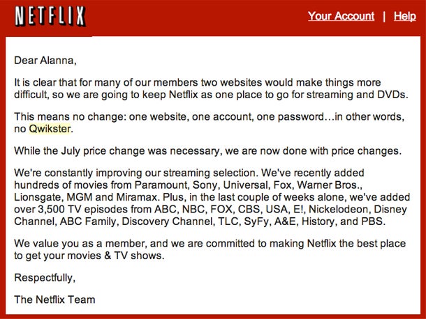
A great example of this is the infamous Netflix/Qwikster debacle of 2011. By creating Qwikster, Netflix committed not one but two serious branding mistakes. Not only is the name "Qwikster" reminiscent of a defunct and outdated file sharing service from the early 2000s, but the service itself was not one for which Netflix's customers had any need or desire. Why, when they could have streaming video and DVD delivery provided by one company, would Netflix customers rather pay separately for two services offered by two distinct websites?
Qwikster was a sloppy attempt to gloss over a huge price increase in Netflix's service offerings. The experiment went so badly that Netflix quickly reversed itself and reverted to a single brand, albeit one with separate streaming and DVD pricing plans.

It's not always service or product changes that brands misguidedly try to force upon users. When Instagram recently implemented changes to its Terms of Service that users deemed unacceptable, the outrage was so pronounced that the photo-sharing service quickly backpedaled by apologizing for "confusing" terms that were misinterpreted by users.
3. Offending users:
With the creation of "Bic for Her" pens, Bic learned the hard way that (surprise!) consumers don't take kindly to products which are perceived as condescending or patronizing. Bic's pastel-colored pens created to meet the "unique" writing needs of the female gender sparked outrage and derision across the internet and represented a major branding blunder for the pen manufacturer.
Related: The Logo Mishaps of Giant Brands
It should go without saying that offending users is a one-way ticket to brand disaster.
What branding mistakes have you seen lately that should be avoided at all cost? Let us know in the comments below.


