How to Make Your Facebook Cover Photo Stand Out
Your Facebook cover photo is one of the first things people see when they visit your Facebook Page.

This story originally appeared on Buffer
The Facebook cover photo — it seems like it should be easy to pick one, yet finding the perfect image can be really hard at the same time.
You only get one; one photo, one shot to make a good impression, one chance to convey a distinct feeling, so what should it be?
Related: How to Keep Up With Social Media Updates in 10 Minutes a Day
Your Facebook cover photo is one of the first things people will see when they visit your Facebook Page, and that is exactly why it is so important to make the best first impression possible and for the cover photo to convey exactly what it is you are aiming for. Even though it sounds simple, we’ve found that it’s pretty tough! No worries, though, we’re here to help you.
Let’s jump in and figure out the best way to make the most out of your Facebook cover photo, together.

In this article, we’ll do three things:
- Introduce you to the Facebook cover photo and ideal dimensions.
- Guide you through how to create a cover photo and how to select the perfect image.
- Provide some examples of Facebook Pages with brilliant cover photos.
Let’s begin with a quick summary of cover photos and the best image size to use…
What’s the ideal size for a Facebook cover photo?
820 pixels wide by 462 pixels tall
The best image size to use for your Facebook Page cover photo can vary. According to Facebook, your cover photo:
- Displays at 820 pixels wide by 312 pixels tall on your Page on desktops and 640 pixels wide by 360 pixels tall on smartphones,
- Doesn’t display on non-smartphones,
- Must be at least 399 pixels wide and 150 pixels tall.
- Loads fastest as an sRGB JPG file that’s 851 pixels wide, 315 pixels tall and less than 100 kilobytes.
Whoa, okay. So what does all of that mean?
It means that even though we only get one photo, Facebook is going to use it in two very different ways:
- In the rectangular format of 820 pixels wide by 312 pixels tall for desktop;
- And the ever-so-slightly more squarish format of 640 pixels wide by 360 pixels tall for mobile.
If you want to use a single image that works pretty well on both desktop and mobile, 820 pixels wide by 462 pixels tall seems to be the best.
New: Cover video!
You can now use a video, instead of a static cover photo. With a video, you can share more about your business and tell a longer story.
Here are the specifications:
- It should be at least 820 pixels wide by 312 pixels tall.
- It can be 20 to 90 seconds long.
Pro tip: If you found an image or video that you love and the dimensions are a bit off, you can still use it! You’ll want to choose that image or video (or upload it), and then you’ll be allowed to ‘reposition’ it. With the reposition feature, Facebook is essentially allowing you to crop your cover photo in a way that you think best fits in the space.
Desktop vs. mobile
It’s great always to be mindful that Facebook Page cover photos on desktops and cover photos on mobile look different.
For example, here’s how a cover photo looks on a desktop:

And here’s how it looks in the Facebook mobile app:

They look similar, but there is a slight difference:

On mobile, the top and bottom portions are slightly expanded — by 75 pixels each to be precise — assuming you didn’t reposition the photo. The parts highlighted in red are not shown on your Page when viewed from a computer.
What’s cool here is that Facebook doesn’t stretch and squeeze the same image, they change the crop. This is awesome because it ensures that your image looks its best by not distorting anything.
Desktop sizing guide
With the new Facebook Page design, all the things that used to be on top of your cover photo (such as your profile photo, Page name, Like button, etc.) are moved out of the cover photo — yay!
For personal Facebook profiles, your profile photo, your name and several buttons still overlay the cover photo.
Double check your design on mobile
If you’re using text on your cover photo, like a call-to-action (CTA), you’ll want to pop over to the Facebook mobile app to take a peek just to make sure there’s nothing wonky going on. For example, if your cover photo is not tall enough, the sides of your photo (or a few characters of your CTA) might be cropped away on the mobile app.
How to create your cover photo
If you have some design skills, creating your own cover photo from the ground up using software like Photoshop is an excellent way to go. Going this route allows you to create a pixel-perfect representation of how you want to portray yourself or your business.
Related: How to Create a Stellar Social Media Marketing Plan for Under $100
Photoshop cover photo templates
To help you to jump straight into designing, we’ve created a Facebook cover photo template (820 x 462px).

This is how it looks like on desktop and mobile:
You can see an example of this here. (Hat tip to Cover Photo Size Helper — so helpful!)
Here are a few extra details for designers to consider about your Page’s profile picture:
- Displays at 170×170 pixels on your Page on computers, 128×128 pixels on smartphones and 36×36 pixels on most non-smartphones
- Will be cropped to fit a square
We know that we might not all be designers, but that doesn’t mean we can’t all have a beautiful Facebook cover photo. Here are some places you can look at to create your cover as well as some tips for making sure it fully represents you and your business.
Your photos
Your Facebook cover photo should be all about you or your business, so why not use one of your photos that represent you?
During our Madrid retreat, we took a team photo, which became our Facebook cover photo for several months.

Stock photos
If you don’t have any personal photos you would like to share, how about using a beautiful stock photo? We even shared 53 free image sources for you to find the perfect image for your cover photo. My favorite websites to find beautiful stock photos are Unsplash and Pixabay.
If the license of the photo allows, I would encourage you to edit or enhance whatever photo you pick with Pablo, Canva or PicMonkey to make it more personal. For example, you could pick one of your favorite quotes and lay it over the photo, and Pablo even has a few beautiful quotes you can pick directly in there.
Canva
If you don’t want to use a photo or if you’d like even more help to create your cover photo, Canva offers pre-made templates for you to use and customize however you would like.
To find these templates on Canva, select “More…” when you are creating a design and look for “Facebook cover”.
How to select your cover photo
Now that we know how to create your cover photo, the question is what kind of cover photo you should select? Are there cover photos that work best than others? Let’s investigate.
Best practices
First up, let’s discuss some of the best practices when it comes to a Facebook cover photo. Hubspot has put together a great list of Do’s and Don’ts when it comes to cover photos. Here are some of the highlights:
- Follow Facebook’s guidelines
- Respect Facebook’s required dimensions (820px wide by 312 px tall for desktops)
- Stay mainly visual and have a clear focal point
- Keep in mind how your cover photo will look like on mobile
- Integrate your cover photo design with the rest of your page
What type of image attracts people?
We looked into some of the components that make images shareable which turned out to be:
- Emotion: Making people feel, leads them to take action
- Relevance: Including something that fits with your audience’s interest
- Colors: Picking the right colors that will lead to the most shares
- Typography: Choosing the right font that will make your message clear
- Hashtags and text: Find the right words that will lead your audience to interact
These components can also be applied to your Facebook cover photo to make people feel a certain way or take a specific action when they come to your page.
For example, Coca-Cola’s cover photo shows several happy young adults clinking their coke bottles. This is likely to be in the hopes of making people feel happy when thinking of Coca-Cola and to make the connection in people’s mind that drinking a coke means happiness. Straightforward and effective!

Where do people look?
When coming up with your perfect cover photo, it might be interesting to look into some eye tracking studies. Something that I found particularly interesting in an article from Kissmetrics on the subject is the idea of “directional queues.”
It was found that if you would like to draw attention to a particular item in an image, having a visual queue like a person’s gaze looking at that item will guide viewers to what they should look at next. This could be an interesting way to use a person’s gaze in your Facebook cover photo.

Something else Kissmetrics found that might be worth playing around with is to include an element that “pops” in your cover photo. That element should be the one that matters and the one that calls for action.
For example, when HubSpot launched their Summer Startup competition, they changed their cover photo to encourage people to apply.

Thinking outside the box
The cover photo is a great way to express yourself but also a way to stand out when people visit your page. Here are some ways you can use your cover photo:
- Use your cover photo to promote your social media campaigns

- Change your cover photo based on special occasions, events, sales or holidays

- Use your cover photo to send people to a special offer

- Ask your fans to “Like” your page
- Ask your fans to share your page
- Include Easter Eggs that lead fans to a special giveaway or special event
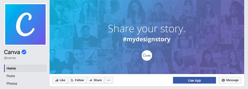
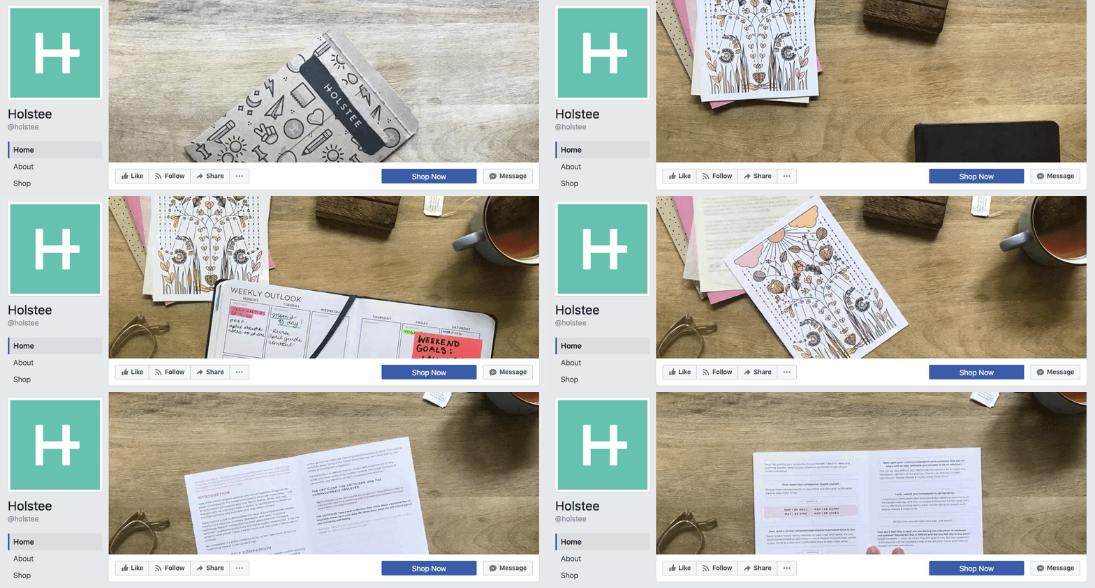
Who does it well? A showcase of great cover photos and videos.
Now that we know what makes a good Facebook cover photo, how about we take a look at some of the Pages that do it well? Hopefully, you might find some inspiration.
Related: 7 Social Media Analytics and Reporting Tips for Becoming a Data-Savvy Marketer
Photos


Videos


Over to you
Before I turn it over to you, I have one last cover photo I wanted to share with you… yes you guessed it, it’s the Buffer cover video!

With this video, we wanted something that reflects what Buffer is, and Buffer is nothing without the people behind it.
Our team is such an integral part of Buffer that it makes sense the team would earn the coveted cover photo spot on Facebook. The video also gives a face to the company that people can connect with, and as our community is very important to us, it seems like the perfect choice.
The Facebook cover photo — it seems like it should be easy to pick one, yet finding the perfect image can be really hard at the same time.
You only get one; one photo, one shot to make a good impression, one chance to convey a distinct feeling, so what should it be?
Related: How to Keep Up With Social Media Updates in 10 Minutes a Day


