Brand Reinvented: How 3 Companies Gave Their Products a Fresh Start

This story appears in the April 2016 issue of Entrepreneur. Subscribe »
Project #1: Become more mass-market.

The launch:
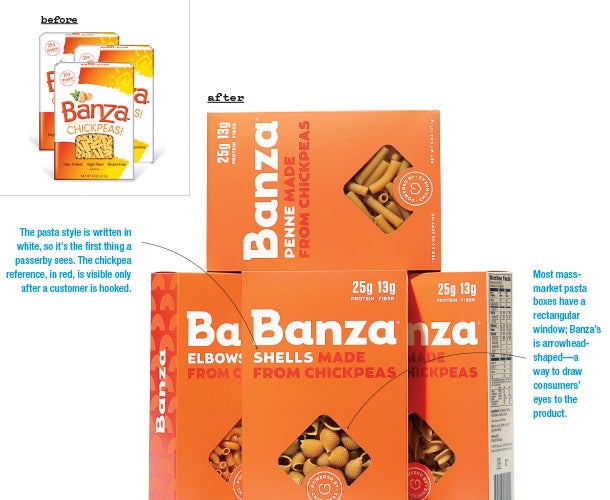
Brothers Brian and Scott Rudolph created a protein-rich chickpea pasta and began selling it in 2014 under the name Banza. Their box was playful, frilly and leaned hard on its special ingredient — shouting chickpeas and showing an image of the beans. “In food, you need leverage in the marketplace before you can start pushing your brand to its final vision,” says Scott, and this branding landed Banza in many health-food aisles. Within a year, it was stocked at 1,700 outlets and was the top-selling pasta storewide at Fairway Market in New York City. Now it was time for that “final vision.”
The reboot:
The Rudolphs wanted to go mainstream and stock Banza alongside the Barillas and Ronzonis of the world, going after the everyday pasta eater. So in 2015 they hired branding firm Roger and design agency Gander. First step, says Roger founder Gillian Grefé: Understand Banza’s new market. “Grocery stores are filled with healthy alternatives, and what do you see on the front panel of the packaging? Every health benefit, every claim, a lot of noise. That would intimidate our target consumer,” says Grefé. The mass-market pasta aisle, however, is a place of minimalist packaging and few health claims.
Gander stepped in and created a simpler, less graphical design. A few nutritional callouts — 25 grams of protein and 13 grams of fiber — were added to the top right corner, a familiar spot for shoppers. But while most pasta packaging is blue, Banza went red — a bid to stand out. And it changed its tagline from “Pasta made from chickpeas!” (announced big and boldly) to “Powered by chickpeas” (wrapped around a squiggly drawing of a bean that looks like a heart). “We didn’t want to scare anyone off,” says Grefé. “We wanted this to feel like a realistic replacement to a meal they know and love.”
The results:
The new packaging hit shelves in March 2016, so it’s too early to track reactions. But Brian feels good about the brand’s modified message: “We wanted Banza to be the modern pasta company,” he says. It went from the health-food aisle to what he calls “sneaky healthy.”
Project #2: Become more sophisticated.

The launch:
Summer Brown began hand-making an all-natural sunblock for her kids in 2013 and sold it online as Butterbean Sunscreen. “The branding was really basic — silly hometown-printshop-style stuff,” she says. Even the logo, which she called the Butterbean Baby, was hand-drawn at home. When the labels would get wet, the ink would run. But as sales rose, she had little time to upgrade. In fact, she was so busy that when she went into labor with her fifth child, she made a pit stop at the post office — because there were orders she needed to ship.
The reboot:
Brown landed her sunscreen in local stores, but she knew its branding would turn off national retailers. So in 2014, she hired Condensed, a Brooklyn branding agency that focuses on startups. “We didn’t want to start from scratch, because she did have a strong following,” says Teresa Lagerman, Condensed’s head of strategy. But she saw problems Brown hadn’t anticipated. Butterbean’s branding was so childlike, it projected that it was only for children — but why not teens and parents, too? Lagerman needed to balance playful with mature, so she began working on typography that has “wide-open counters and rounded strokes, to appear friendly and inviting but not silly.”
The bottles’ colors were revamped: Gone was the yellow, which was unusual in the marketplace, and in came white (to project cleanliness) and aqua (standard for beach products, but made lighter to appear premium). The company’s name was tweaked, too. Brown had begun making bug spray, lip balm and more — but had kept the name Butterbean Sunscreen. It became Butterbean Organics. And the agency produced a promotional photo shoot with Brown and her family at the beach. “She’s such a big part of the company story. We wanted that to come through,” Lagerman says.
The results:
“It’s something that young dads, busy moms, teens, tweens and little kids are equally drawn to,” Lagerman says. The rebrand debuted last June and triggered a roughly 40 percent uptick in sales. A few national accounts have since signed on. But the packaging’s first big test is wrapping up now — January to March, big retailers’ prime sunscreen-buying time.
Project #3: Become more trustworthy.

The launch:
In October 2015, Yahya Mokhtarzada cofounded a company called Billninja. Through a website, the service enabled users to monitor and easily cancel their subscription services — from Netflix to wine-of-the-month clubs. Its mascot was a duck-billed platypus dressed up as a ninja, intended to make the company seem friendly. But although users created accounts, few were linking up their financial information (which was necessary for the service to work). The cofounder emailed some people to ask why, and the feedback was unanimous: “It basically was, “This doesn’t seem legit,'” he says. “We had a site that was thrown together by amateurs and a name that was more playful than professional. We needed design and branding that inspired trust.”
The reboot:
Mike Chuvilo, creative director of design agency Ramotion, led Billninja’s reinvention. “People want to share their financial information with a computer, not a human” — or, in this case, a platypus dressed as a human, he says. So, the mascot and the name had to go. They considered many options — Billance, Onebill, Truecharge — and then landed on Truebill. “We wanted a high rate of trust but also simplicity,” says Mokhtarzada. “Those are sometimes at odds with each other.”
Next, it was time for a redesign. “We need to use color as a strong way to get users in the right emotional condition,” Chuvilo says. Financial businesses in the U.S. tend to use green and blue — the color of money plus a color that soothes. (Fun fact: In China, financial firms prefer red.) So Ramotion experimented with the palette until they settled on a mixture that felt unique yet familiar enough to be trustworthy. “It was a much more involved process than I thought it would be,” says Mokhtarzada.
The results:
The Truebill reboot debuted on January 28. At that time, it had 500 users. A month later, it hit 10,000 users. The change also inspired Mokhtarzada to think about other ways to live up to his company’s new name — offering options to track users’ charges and recommending cheaper alternatives for services. “Our customers need to trust us first,” he says.
Project #1: Become more mass-market.

The launch:
Brothers Brian and Scott Rudolph created a protein-rich chickpea pasta and began selling it in 2014 under the name Banza. Their box was playful, frilly and leaned hard on its special ingredient — shouting chickpeas and showing an image of the beans. “In food, you need leverage in the marketplace before you can start pushing your brand to its final vision,” says Scott, and this branding landed Banza in many health-food aisles. Within a year, it was stocked at 1,700 outlets and was the top-selling pasta storewide at Fairway Market in New York City. Now it was time for that “final vision.”


