The Story Behind Brooklyn Brewery’s Iconic Label

Opinions expressed by Entrepreneur contributors are their own.
When you’re starting a business, some of your earliest decisions end up being the most important ones.
For Brooklyn Brewery – which opened its doors in 1987 and is today one of the largest craft breweries in the U.S. — the quality of the beer was, of course, crucial. Brooklyn Lager, still the brewery’s most popular beer by a long shot, was based on an old Brooklyn recipe and thus tethered to the borough’s rich brewing history. But while taste ultimately leaves the most important impression, it doesn’t make the first one. That’s left to the brand’s label.
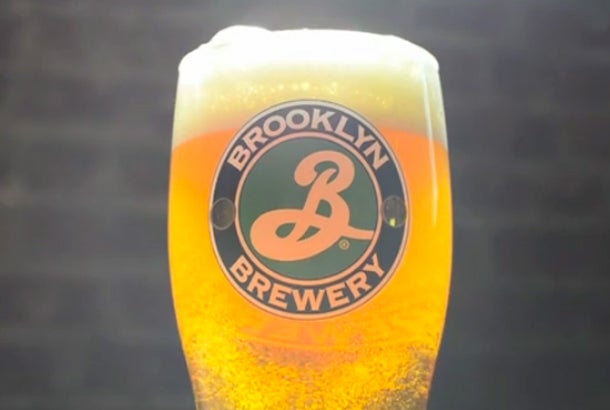
Fortunately, Brooklyn Brewery got that right, too. Its distinctive but simple label – a cursive white “B” enclosed in a circle of green – has become both an international symbol for craft beer and Brooklyn’s unique flavor of artsy but marketable ‘cool.’ (This recognizable tie to Brooklyn has propelled the brewery’s booming export business, which constitutes more than 40 percent of its sales.)

It could have turned out very differently. Brooklyn Brewery co-founder Steve Hindy knew the weighty import of selecting the right label, but not how to go about finding it. A former Middle East correspondent for the Associated Press, he decided to begin with what he did know how to do: Interviews. “I spoke with about 30 different design firms,” he says. “They showed me their stuff, and I learned that it’s not cheap to get an identity…$40,000 at minimum. We’d budgeted $15,000.”
Frustrated with the price and dissatisfied with the stream of design proposals paraded before him, Hindy was at a loss. Until: “My wife said, ‘You’re a journalist. You can cold-call anyone. Why don’t you call the best designer in the city?'”
Related: Lagunitas IPA Founder Cites Nietzsche in Blog Post About Heineken Deal
So Hindy dialed up the office of Milton Glaser, the graphic design legend behind the “I <3 NY” logo. A studio assistant answered, frostily informing him that Glaser didn’t get on the phone for just anyone. “It brought out the reporter in me,” Hindy says. For two weeks he called back daily, until the studio assistant relented and connected him with Glaser. “I blurted out our idea and he said, ‘That sounds like fun!’ Come and see me.'” What’s more, Glaser offered to be paid with stock in the company.

A newspaper man, Hindy wanted the logo to include an eagle (Brooklyn Brewery’s original name was Brooklyn Eagle Beer). The first thing Glaser said was “forget the bird,'” remembers Hindy. A week later, the (birdless) logo was unveiled. Hindy had hoped for a design that incorporated quintessential Brooklyn symbols: the Dodgers, maybe, or the Brooklyn Bridge. Instead, he was faced with a cursive white “B” in a green circle. Not a graphic design legend for nothing, Glaser told him to take it home and live with it for a few days.
Lucky for Hindy – and his business – it eventually clicked. As he explains:
“Seeing it every morning, it sunk in. It evokes the Dodgers, but it’s not purely nostalgia — it’s fresh and yet it looks like a company that’s been around for a long time. It boiled down all the images I had in my head, and expressed them in an elegant, simple way. I think that’s what great design does. You see that ‘B,’ and you can envision the rest of ‘Brooklyn’ written out. It’s dynamic. It’s in motion. It’s fresh. As Milton said, it has shelf authority.”
When you’re starting a business, some of your earliest decisions end up being the most important ones.
For Brooklyn Brewery – which opened its doors in 1987 and is today one of the largest craft breweries in the U.S. — the quality of the beer was, of course, crucial. Brooklyn Lager, still the brewery’s most popular beer by a long shot, was based on an old Brooklyn recipe and thus tethered to the borough’s rich brewing history. But while taste ultimately leaves the most important impression, it doesn’t make the first one. That’s left to the brand’s label.
Fortunately, Brooklyn Brewery got that right, too. Its distinctive but simple label – a cursive white “B” enclosed in a circle of green – has become both an international symbol for craft beer and Brooklyn’s unique flavor of artsy but marketable ‘cool.’ (This recognizable tie to Brooklyn has propelled the brewery’s booming export business, which constitutes more than 40 percent of its sales.)


