Evergreen Content Is the Secret to More Traffic. Here’s the One Reason Most Evergreen Content Fails.
The secret to content that keeps drawing an audience over the long run is that it is genuinely helpful.

Opinions expressed by Entrepreneur contributors are their own.
Whether you’re in commerce or content, we all want more traffic. The reason is obvious and painful. For ecommerce, lack of traffic is the number one cause of failure. And for bloggers, it’s the same. A mere 9 percent of blogs make more than $1,000 a month. Even fewer — 4 percent — crack the $10,000 mark.
What’s the solution? Recently a host of case studies have all trumpeted the power of evergreen content:
“The best evergreen content is the holy grail content marketing. It’s the article that consistently ranks well in search and drives 65 percent of your site traffic even though it was written in 2011.”
But evergreen content isn’t for the faint of heart. It’s time-consuming and labor-intensive. The only thing worse than struggling with traffic is pouring your heart and soul into a resource only to see it flop.
The real solution isn’t to jump on the buzzword bandwagon, but to understand what makes genuinely evergreen content so successful as well as why the pretenders fail. In truth, what separates traffic-driving evergreen content from well-intentioned duds is often one missing ingredient.
Related: 5 Types of Evergreen Content for Your Website
Evergreen content has to help.
At first, that sounds obvious. After all, being helpful is the cornerstone of content marketing itself. When it comes to writing copy, “Every piece of content you create has to do two things: (1) rescue its audience from their own personal hell and (2) deliver them unto their own personal heaven. Great copywriting is about salvation … not sales.” That principle is all the more true for evergreen content.
Unfortunately, most evergreen content fails that two-part test. Why? Because we mistakenly equate long with evergreen.
Take a recent example. To protect the guilty, I won’t name names here, but the piece was a nearly 18,000-word, 127-point, influencer-packed article about SEO mistakes. It was a thing of long-form content beauty and contained a wealth of insights and tips. Ironically, I contributed to it.
The downside was it went too far. There’s a world of difference between size and salvation. Rather than a go-to resource to guide readers through the murky waters of SEO, it was unwieldy and difficult to navigate. There was no clear information hierarchy or concrete takeaways. The same problem often exists with anything that wears the title “Ultimate” or “Skyscraper.”
Related: Why Long-Form Content Performs Better & How to Create It (Infographic)
Bigger isn’t better.
Online, people don’t need a list of a hundred-plus tips, tricks or tools. What they’re desperate for are the easiest, most actionable insights to solve the one problem they’re facing right now, and then the opportunity to drill down into further resources when the time comes. Ask yourself: What hell is my target audience suffering from? What problem steals their sleep and haunts their dreams? What mystery can’t they find an answer to? Where do they hurt?
These are the questions that drive helpful and successful evergreen content. They’re about serving your audience, not showing off. And they’re singular: one hell, one problem, one mystery, one pain … all leading to one answer — or at most, five to 10 — designed for one specific audience. As CEB’s landmark book The Challenger Customer puts it, “customers’ reaction to well-designed thought leadership is: ‘Wow, they’re smart.’ Customers’ reaction to well-designed insight is: ‘Wow, I’m wrong.'” Wrong, in this case, is good because it shows readers exactly how to overcome their hell.
So, what does that look like?
Related: American Express Has a Lot to Teach You About Content Marketing
Helpful and easy evergreen content.
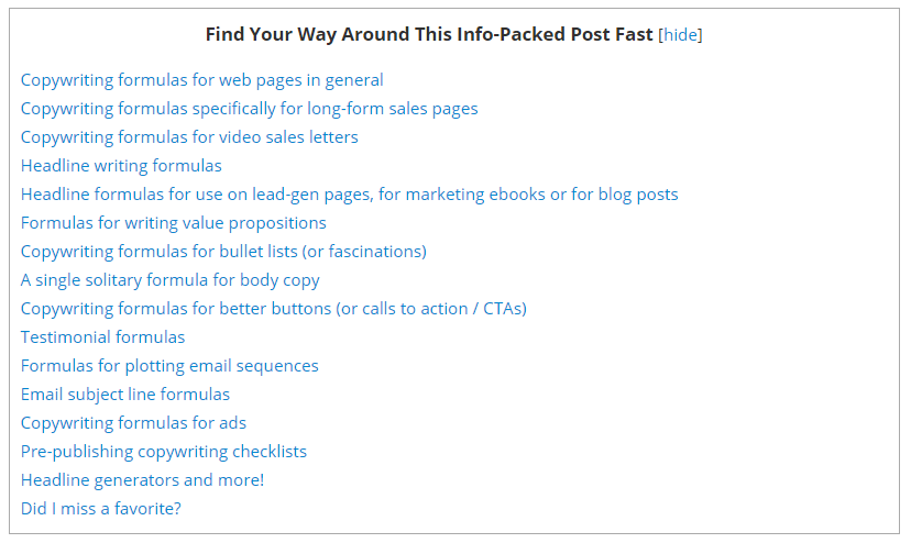
Length isn’t necessarily bad. In fact, long-form is a hallmark of high ranking content across the web. But if it is lengthy, then your visitor must have some way to sort and simplify all that information immediately. For example, Joanna Wiebe’s 11,000-word The Ultimate Guide to No-Pain Copywriting (or, Every Copywriting Formula Ever) opens with a linked table of contents so readers can jump directly where they need help the most:
In a similar show of helpfulness, OnCarrot’s 4,000-word Real Estate Content Marketing: A Strategy Agents (Like You) Can Actually Use to Grow Your Business opens and closes with a call-to-action to “get a simplified guide and easy-to-follow checklist.”
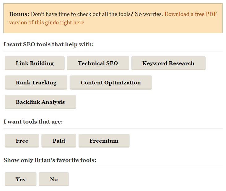
Brian Dean’s 10,000-word SEO Tools: The Complete List — which contains 184 reviews each with images and direct links — quadruples down on helping its visitor by not only giving them a PDF option but three sets of on-page filters:
Lastly, when it comes to merging length with simplicity (i.e., making it helpful and easy), few approaches stand out like getting visual. Whether your content revolves around handling negative feedback, the top copywriting books, or even lawn care, this one-two combination ensures the depth that Google loves and the help your visitors crave.
Related: 4 Meeting Mistakes You’re Probably Making and How to Fix Them
Evergreen content has to “save” them.
We all want more traffic.
However, evergreen content lives and dies by a single word — helpful. Don’t overwhelm your audience. Length and depth are key, but all the 100-point checklists, influencer-packed round-ups and so-called “ultimate” guides won’t save you … if your content doesn’t save them.
Whether you’re in commerce or content, we all want more traffic. The reason is obvious and painful. For ecommerce, lack of traffic is the number one cause of failure. And for bloggers, it’s the same. A mere 9 percent of blogs make more than $1,000 a month. Even fewer — 4 percent — crack the $10,000 mark.
What’s the solution? Recently a host of case studies have all trumpeted the power of evergreen content:
“The best evergreen content is the holy grail content marketing. It’s the article that consistently ranks well in search and drives 65 percent of your site traffic even though it was written in 2011.”
But evergreen content isn’t for the faint of heart. It’s time-consuming and labor-intensive. The only thing worse than struggling with traffic is pouring your heart and soul into a resource only to see it flop.


