The Three Golden Rules Of Social Media Visuals Getting your visuals right on social media is super important but super easy to get wrong.
By Carla Saliba
Opinions expressed by Entrepreneur contributors are their own.
You're reading Entrepreneur Middle East, an international franchise of Entrepreneur Media.

Getting your visuals right on social media is super important but super easy to get wrong. That's why we've put together our golden rules for social media visuals, with before and after examples of how to get them right.
Let's begin…
Rule #1 - Brand it up
Social media platforms now give you so many options for making your pages and profiles on-brand. Your page is your shop window and face to the world, so make it appealing and inviting. This is your chance to show a bit of creativity, so go for it!

There's also more you can do with a profile picture than just stick your entire logo on there. This is particularly true if it's lots of text, as people won't be able to see it well in the thumbnail when scrolling through their feed. At infographic.ly we use our "o', which is also a doughnout chart!

If you do have a text only logo, try to capture the personality of your brand. We love what Net-A-Porter do with their profile picture, which they also update seasonally (although we don't recommend this for smaller brands).

Rule #2 - Don't overstuff information
Information overload is very serious business, and it's very possible to do it with pictures or graphics. It's particularly relevant to infographics but can happen to any well-meaning visual.
Remember that less is more. Eyes need space to rest between taking in information, and a primary focus is really important too. (Note also that Facebook won't let you promote images with more than 20% text!) Check out what happens when some of the information is presented separately. It's still bright and eye-catching, only now it won't make your brain hurt trying to process all the information at once. Luckily, Instagram now allows for carousel images which is a great way to relay more information in just one post.

Rule #3 - Keep it consistent
Consistency is so key on social media if you want people to remember you and continue engaging with you. But this isn't just what you talk about, it's how you present yourself too.
At a bare minimum, you should be keeping your fonts, colours and logos consistent, but there's so much you can do to make yourself unique and memorable, especially when it comes to images!
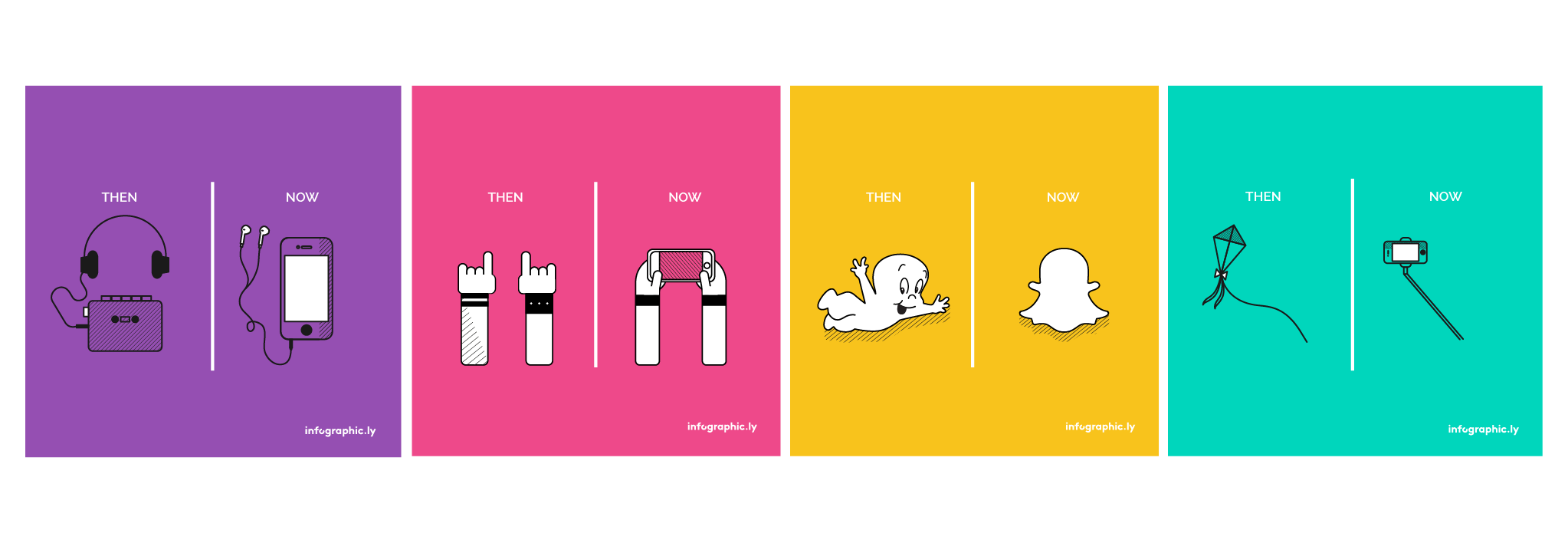
This could be a visual or photographic style, or even a content series. For example, every Thursday we post a #TBT of then vs now, to show how much things have changed over the years - because who doesn't love a bit of nostalgia.

(You can find the full collection on Instagram on #50daysoftbt)
So there you have it - our three golden rules for getting social media visuals right! Follow them closely and let your brand shine across the Twitterverse.


