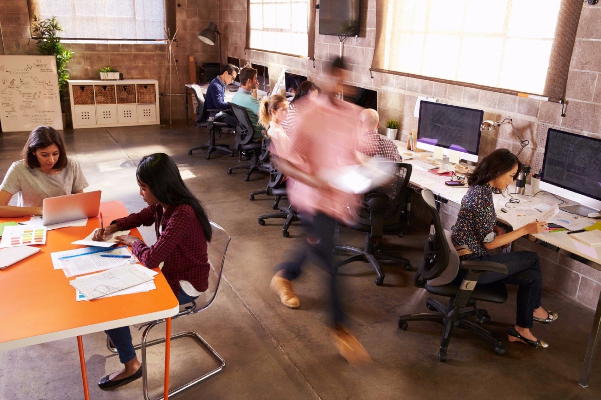
#7 Common Design Mistakes of Office Architecture A balance between private and collaborative spaces at work is crucial
By Noopur Doshi
Opinions expressed by Entrepreneur contributors are their own.
You're reading Entrepreneur India, an international franchise of Entrepreneur Media.

An ideal work space will make the employee or visitor feel good and will make them want to stay back and spend more time. The design of the office should be welcoming and make one feel comfortable. It is essential that the office is designed keeping in mind the requirements of the employees and the kind of field the organization is in. Get it wrong and your company can suffer a host of ill-effects which can eventually harm the business and also affect the employees.
The following are the seven common office design mistakes, which can be avoided:
1. Poor Lighting
The effect of lighting in an office space is extremely important. The lighting should be just perfect! Basis the effect, the employees can feel motivated. If the office is dimly lit, it can affect the mood and in turn affect the health of the employee. One wouldn't want their employees to strain their eyes and find it difficult to focus on their work. The best light one can possibly have in their office is natural light. One must have adequate number of windows for the sunlight to come in. Excess of light can also harm the employees by giving them headaches and other health related issues.
2. No Balance Between Private and Collaborative Work Spaces
Networking at a work place is essential. This encourages a strong company culture for which a collaborative work space is required. Similarly, for an individual to grow, learn and work with full attention, a private space is needed too. A balance between private and collaborative spaces at work is crucial. Nowadays, co-working spaces are on the rise and they have been trying to match up to all the office requirements.
3. Don't be Afraid of Colour
An office space needn't necessarily look dull and plain. If not the entire office, a part of the work space can flaunt some colour. Could be as simple as a wall or some mural. This will enhance the look and feel of the office and give it a great vibe too.
4. Style & Cost Over Comfort
Nothing beats comfort. Many offices just believe in having the best interiors, avoiding the comfort factor. The number one focus is to obtain furniture that aims to satisfy and support your employees' comfort throughout the day. Style is always secondary. The furniture in the office should allow the employee to sit for longer hours.
5. Design of the Reception Area
The reception area plays a vital role in creating an impression of the people visiting the office. This space is the entry and serves as a waiting area for your visitors. It plays an important role in creating an impact and hence should look neat and presentable. There must be sufficient seating and a reception desk to attend to them. Plants aid in achieving patience and should hence be placed at the reception area.
6. Effective Pplanning and Design
Small spaces, too, can be made to feel comfortable and compact rather than cramped. Effective planning and design need not be only for larger offices. Strategic choice of colours and materials can assist here – for example, painting walls in cooler colours rather than darker ones can make a space seem larger, and using glass partitioning can give a sense of airiness and expansion. Without planning, the work place can look like a mess and affect the productivity of the employees.
7. Lack of Entertainment Space
Entertainment can keep your employee motivated and interested. Nowadays, some element of entertainment needs to be incorporated in the design of your corporate space. This can be in any form - a TV, a foosball table or a wall that has scrabble on it. The design of your work space should give the employee space and freedom to move around.


